Flutter Basics: Widget Tree, Row, Column and Stack
Last updated:
5 min read

Today is a historic day! After learning Dart basics, I finally transitioned to Flutter. The setup steps are in the Flutter getting started guide; in this post I jump straight into code. My first impression: Widgets, widgets, widgets everywhere!
Live Demo: Row, Column and Stack Examples
Try Flutter's basic layout structures interactively:
💡 If the example above doesn't load, click DartPad to run it in a new tab.
Understanding Flutter's Structure
The first thing that caught my attention in a Flutter project was this: Everything is like a tree structure. It starts from the main function, then the app widget, then the page, then scaffold... A nested structure.
Basic Flutter Structure
import 'package:flutter/material.dart';

void main() {
  runApp(const MyApp()); // App starts here
}
The main() function is where everything begins. We start our app by saying runApp().
Main Widget (MyApp)
class MyApp extends StatelessWidget {
  const MyApp({Key? key}) : super(key: key);

  @override
  Widget build(BuildContext context) {
    return MaterialApp(
      title: 'First App',
      debugShowCheckedModeBanner: false, // Remove debug banner
      theme: ThemeData(
        primarySwatch: Colors.blue,
      ),
      home: const MyHomePage(title: 'My First Project'),
    );
  }
}
MaterialApp allows you to build apps according to material design rules in Flutter. The home parameter specifies the first page to open.
Page Widget (MyHomePage)
class MyHomePage extends StatefulWidget {
  const MyHomePage({Key? key, required this.title}) : super(key: key);

  final String title;

  @override
  State<MyHomePage> createState() => _MyHomePageState();
}
StatefulWidget is for widgets whose state can change. For example, if you're making a button counter, the screen needs to update when the number changes. That's what StatefulWidget is for.
State Class
class _MyHomePageState extends State<MyHomePage> {
  @override
  void initState() {
    super.initState();
    print("Page loaded!");
  }

  @override
  Widget build(BuildContext context) {
    return Scaffold(
      appBar: AppBar(
        title: Text(widget.title),
      ),
      body: Center(
        child: Text("Hello Flutter!"),
      ),
    );
  }
}
initState() runs once when the page first opens. API calls are generally written here. The order in which initState, build and dispose run is explained in the Flutter life cycle post.
Scaffold is a page skeleton. It has parts like AppBar (top bar), body (content), bottomNavigationBar.
Flutter's Tree Structure
The key to understanding Flutter is grasping this tree structure:
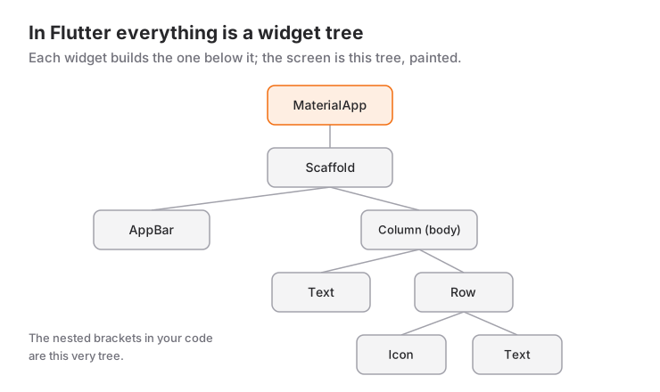
Main
 └─ MyApp (MaterialApp)
     └─ MyHomePage (Scaffold)
         ├─ AppBar
         └─ Body
             └─ Widgets...
Everything is nested. Think of it like this: There's a building (MaterialApp), the building has rooms (Scaffold), the rooms have furniture (Widgets).
Layout Design: Row, Column and Stack
There are three basic structures for layout in Flutter. At first I was confused about which one to use when.
Row - Horizontal Layout
Row arranges widgets side by side. From left to right.
Row(
  children: [
    Container(width: 80, height: 80, color: Colors.blue),
    Container(width: 80, height: 80, color: Colors.red),
    Container(width: 80, height: 80, color: Colors.yellow),
  ],
)
Screen output: 🟦🟥🟨 (three squares side by side)
Column - Vertical Layout
Column arranges widgets one below the other. From top to bottom.
Column(
  children: [
    Container(width: 80, height: 80, color: Colors.blue),
    Container(width: 80, height: 80, color: Colors.red),
    Container(width: 80, height: 80, color: Colors.yellow),
  ],
)
Screen output:
🟦
🟥
🟨
(three squares one below the other)
Stack - Overlapping Layout
Stack places widgets on top of each other. Like layers.
Stack(
  children: [
    Container(width: 130, height: 100, color: Colors.blue),
    Container(width: 80, height: 70, color: Colors.red),
    Container(width: 30, height: 60, color: Colors.yellow),
  ],
)
Large blue box at bottom, medium red in middle, small yellow on top. All aligned from top-left corner.
Row and Column Combination
Now let's make a more complex layout. Combining rows and columns:
Goal: 2 rows, 4 columns in each row (8 boxes total)
Column(
  children: [
    // First row
    Row(
      children: [
        Container(width: 80, height: 80, color: Colors.yellow),
        Container(width: 80, height: 80, color: Colors.red),
        Container(width: 80, height: 80, color: Colors.green),
        Container(width: 80, height: 80, color: Colors.blue),
      ],
    ),
    // Second row
    Row(
      children: [
        Container(width: 80, height: 80, color: Colors.red),
        Container(width: 80, height: 80, color: Colors.blue),
        Container(width: 80, height: 80, color: Colors.yellow),
        Container(width: 80, height: 80, color: Colors.green),
      ],
    ),
  ],
)
Result:
🟨 🟥 🟩 🟦
🟥 🟦 🟨 🟩
The logic is like this: Main structure is Column (vertical). Inside are two Rows (horizontal). Each Row has four Containers.
Container Widget
Container is one of Flutter's most basic widgets. Think of it like a box.
Simple Container
Container(
  width: 100,
  height: 100,
  color: Colors.blue,
  child: Text("Hello"),
)
Centering Content
Container(
  width: 100,
  height: 100,
  color: Colors.blue,
  child: Center(
    child: Text(
      "Hello",
      style: TextStyle(color: Colors.white),
    ),
  ),
)
The Center widget centers what's inside it; the details are in the Center widget post.
Margin and Padding
Container(
  width: 100,
  height: 100,
  margin: EdgeInsets.all(10),  // Outer spacing
  padding: EdgeInsets.all(20), // Inner spacing
  color: Colors.blue,
  child: Text("Hello"),
)- Margin: Space outside the Container
- Padding: Space inside the Container
If you only need inner spacing, using the Padding widget directly instead of a Container is the lighter solution.
Rounding Corners
Container(
  width: 100,
  height: 100,
  decoration: BoxDecoration(
    color: Colors.blue,
    borderRadius: BorderRadius.circular(20),
  ),
  child: Center(
    child: Text("Rounded"),
  ),
)
When you use decoration, you must write the color parameter inside decoration.
Adding Border
Container(
  width: 100,
  height: 100,
  decoration: BoxDecoration(
    color: Colors.white,
    border: Border.all(
      color: Colors.blue,
      width: 3,
    ),
  ),
  child: Center(
    child: Text("Bordered"),
  ),
)
Alignment in Row and Column
We can align widgets where we want:
MainAxisAlignment
Row(
  mainAxisAlignment: MainAxisAlignment.center, // Center
  children: [
    Container(width: 50, height: 50, color: Colors.red),
    Container(width: 50, height: 50, color: Colors.blue),
  ],
)
For Row, mainAxis is horizontal. Options:
start: Align leftend: Align rightcenter: CenterspaceBetween: Equal space betweenspaceAround: Equal space aroundspaceEvenly: Equal space everywhere
CrossAxisAlignment
Row(
  crossAxisAlignment: CrossAxisAlignment.center, // Center vertically
  children: [
    Container(width: 50, height: 50, color: Colors.red),
    Container(width: 50, height: 100, color: Colors.blue),
  ],
)
For Row, crossAxis is vertical. Options:
start: Align topend: Align bottomcenter: Centerstretch: Stretch
For alignment to have any effect, how much space the Row occupies matters too; I cover that relationship with mainAxisSize in the mainAxisSize and alignment post.
Practical Example: Calculator Layout
Column(
  mainAxisAlignment: MainAxisAlignment.spaceEvenly,
  children: [
    // Screen
    Container(
      width: double.infinity,
      height: 100,
      color: Colors.grey[300],
      child: Center(
        child: Text(
          "0",
          style: TextStyle(fontSize: 48),
        ),
      ),
    ),
    // Buttons
    Row(
      mainAxisAlignment: MainAxisAlignment.spaceEvenly,
      children: [
        createButton("7"),
        createButton("8"),
        createButton("9"),
        createButton("/"),
      ],
    ),
    Row(
      mainAxisAlignment: MainAxisAlignment.spaceEvenly,
      children: [
        createButton("4"),
        createButton("5"),
        createButton("6"),
        createButton("*"),
      ],
    ),
  ],
)
My First Day Takeaways
- In Flutter everything is a widget
- Row horizontal, Column vertical, Stack overlapping
- Container is the widget I'll use most
- Alignment is done with MainAxisAlignment and CrossAxisAlignment
- Scaffold is a page skeleton
Tomorrow I'll look at button clicking, state management and dynamic content topics. This Flutter journey is really exciting!
Useful Resources
Want to learn Flutter with me?
Keep learning Flutter! 🚀
Frequently Asked Questions
What happens if the widgets in a Row don't fit on the screen?
You'll see a yellow-and-black striped "overflow" bar at the edge of the screen and an "A RenderFlex overflowed" warning in the console. The fix is to wrap the overflowing children in Expanded or Flexible, or to put the Row inside a SingleChildScrollView if the content should scroll.
How do I choose between StatelessWidget and StatefulWidget?
If the widget only displays the parameters it receives, a StatelessWidget is enough. If the screen has to redraw because of user interaction or incoming data (a counter, a form, a loading state), use a StatefulWidget.
Do I have to use a Container for every box?
No. Padding for spacing only, SizedBox for size only and Center for centering only are all lighter. Reach for Container when you need a decoration such as color, border or rounded corners.
Related Posts
Flutter: Flexible Spaces with Spacer Widget
What Spacer is under the hood, sizing gaps with flex, how it differs from SizedBox and mainAxisAlignment, and why it breaks in scrollable areas.
Flutter: Space and Alignment Control with mainAxisSize
max vs min in mainAxisSize, how constraints interfere, why mainAxisAlignment seems to do nothing, and recipes for dialogs, bottom sheets and button groups.
Flutter: Expanding Space with Expanded Widget
A deep dive into Expanded: how the flex ratio is computed, nesting, why it only works inside Row and Column, and the three errors you see most often.