Flutter: SingleChildScrollView, ListView, NestedScrollView
Last updated:
9 min read

SingleChildScrollView is the simplest scrolling widget in Flutter: it makes a single child, usually a Column, scrollable. It should be the first thing you reach for on screens where a handful of different, known widgets stack vertically and might overflow on a small phone: a login form, a settings page, a product detail screen. This post is about the widget itself, its relationship with the keyboard, and why it fights with Expanded inside a Column; after that it shows how it differs from ListView and NestedScrollView and which one belongs on which screen.
Live Demo
You can try this widget in the interactive example below:
💡 If the example above doesn't load, click DartPad to run it in a new tab.
What Is SingleChildScrollView?
As the name says, it has exactly one child, and when that child is taller than the screen the difference becomes scrollable. If the child fits, nothing happens; the widget behaves like an invisible box. That is why wrapping any fixed-content screen that "might overflow" is a safe habit.
Basic Usage
SingleChildScrollView(
  child: Column(
    children: [
      Container(height: 200, color: Colors.red),
      Container(height: 200, color: Colors.green),
      Container(height: 200, color: Colors.blue),
      Container(height: 200, color: Colors.yellow),
      // More content exceeding the screen...
    ],
  ),
)
Use the same Column without the wrapper and on a small screen the content overflows, with the well-known yellow and black striped warning at the bottom.
Horizontal Scrolling
scrollDirection: Axis.horizontal does the same for a Row. It is handy for a horizontal strip of cards or a wide table:
SingleChildScrollView(
  scrollDirection: Axis.horizontal,
  child: Row(
    children: [
      Container(width: 150, color: Colors.red),
      Container(width: 150, color: Colors.green),
      Container(width: 150, color: Colors.blue),
    ],
  ),
)
Important Properties
| Property | Description |
|---|---|
scrollDirection |
Scroll direction (Axis.vertical / Axis.horizontal) |
padding |
Space around the content; it is part of the scrollable area |
reverse |
Starts scrolling from the end |
physics |
Scroll behavior (bouncing, clamping, none) |
controller |
A ScrollController to read the position and scroll programmatically |
keyboardDismissBehavior |
With onDrag, the keyboard closes when the user scrolls |
Scroll Physics
The default behavior follows the platform: bouncing on iOS, clamping with a blue glow on Android. You change it through physics:
BouncingScrollPhysics: iOS-style bounce.ClampingScrollPhysics: Android-style, stops at the edge.NeverScrollableScrollPhysics: disables scrolling; given to the inner widget in nested scrolling.AlwaysScrollableScrollPhysics: allows scrolling even when the content is short; needed for pull-to-refresh withRefreshIndicator.
SingleChildScrollView(
  physics: const BouncingScrollPhysics(),
  child: Column(children: [/* ... */]),
)
The Keyboard and Form Screens
When the keyboard opens, Scaffold shrinks the body by the keyboard's height (resizeToAvoidBottomInset is on by default). If the form's Column cannot scroll, it no longer fits in that smaller area and overflows. SingleChildScrollView solves this in two ways: the content becomes scrollable inside the reduced area, and the focused TextField is scrolled into view automatically without any extra code. Add keyboardDismissBehavior: ScrollViewKeyboardDismissBehavior.onDrag and the keyboard closes as soon as the user drags the content:
SingleChildScrollView(
  keyboardDismissBehavior: ScrollViewKeyboardDismissBehavior.onDrag,
  padding: const EdgeInsets.all(16),
  child: Column(
    children: const [
      TextField(decoration: InputDecoration(labelText: 'Name')),
      SizedBox(height: 16),
      TextField(decoration: InputDecoration(labelText: 'Email')),
      // ...
    ],
  ),
)
For validation and TextFormField details, see the Form widget post.
When to Use It and When Not To
Pick the Column + SingleChildScrollView pair when the widgets on screen are different from each other and their number is known up front: login form, profile editing, settings, product detail, onboarding page. On these screens the content is built in one go anyway, and scrolling is only insurance against small screens and the keyboard.
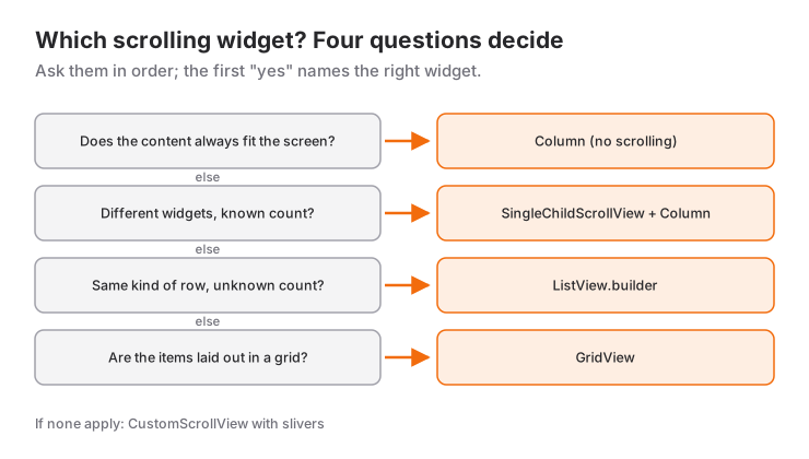
In these cases another widget fits better:
- If you show rows of the same kind in a number you do not control (messages, products, search results), use ListView.builder. A
ColumninsideSingleChildScrollViewbuilds every row at once; with 20 rows nobody notices, with 2,000 the screen freezes. - If the items form a grid you want
GridView, and if several scrollable sections must merge on one screen (a header, a horizontal list, a vertical list) you needCustomScrollViewand slivers. If tabbed lists sit under a collapsing header, you needNestedScrollView; the differences are in the next section. - If the content definitely fits on every screen (a confirmation screen with three buttons, say) there is nothing to scroll; a plain
Columnis enough.
How It Differs from ListView and NestedScrollView
All three scroll, but they build their content differently and solve different problems:
| Widget | How it builds its content | Where it fits |
|---|---|---|
SingleChildScrollView |
The whole single child at once | A known set of different widgets: forms, settings, detail screens |
ListView.builder |
Only the rows visible on screen, as you scroll | Rows of the same kind, long or of unknown count |
NestedScrollView |
Coordinates a header area with a scrollable body inside it | Tabs under a collapsing header, each tab with its own list |
ListView: builds the rows you can see
ListView.builder creates rows as they come into view and lets go of the ones that leave. Even in a list of a thousand rows, only what fits on screen plus a small cache is built at any time. Write the same list as a Column inside SingleChildScrollView and all thousand rows are built in the first frame.
ListView.builder(
  itemCount: 1000,
  itemBuilder: (context, index) => ListTile(title: Text('Row $index')),
)
Details such as separatorBuilder, scroll control and infinite lists are in the ListView usage post, and showing the same data as a grid is in the GridView post.
NestedScrollView: a header with tabbed lists
The typical use of NestedScrollView in the official docs is this: a collapsible SliverAppBar with a TabBar in the header, and a TabBarView in the body where each tab carries its own list. A single CustomScrollView cannot do that, because every tab has its own scroll position. NestedScrollView links the two scrollers: when the user scrolls up, the header collapses first, then the inner list starts to move.
class ProfilePage extends StatelessWidget {
  const ProfilePage({super.key});

  static const _tabs = ['Posts', 'Likes'];

  @override
  Widget build(BuildContext context) {
    return DefaultTabController(
      length: _tabs.length,
      child: Scaffold(
        body: NestedScrollView(
          headerSliverBuilder: (context, innerBoxIsScrolled) => [
            SliverOverlapAbsorber(
              handle: NestedScrollView.sliverOverlapAbsorberHandleFor(context),
              sliver: SliverAppBar(
                title: const Text('Profile'),
                pinned: true,
                expandedHeight: 200,
                forceElevated: innerBoxIsScrolled,
                bottom: TabBar(
                  tabs: [for (final tab in _tabs) Tab(text: tab)],
                ),
              ),
            ),
          ],
          body: TabBarView(
            children: [
              for (final tab in _tabs)
                Builder(
                  builder: (context) => CustomScrollView(
                    key: PageStorageKey<String>(tab),
                    slivers: [
                      SliverOverlapInjector(
                        handle: NestedScrollView.sliverOverlapAbsorberHandleFor(context),
                      ),
                      SliverList.builder(
                        itemCount: 30,
                        itemBuilder: (context, index) =>
                            ListTile(title: Text('$tab $index')),
                      ),
                    ],
                  ),
                ),
            ],
          ),
        ),
      ),
    );
  }
}
Three details make this code correct. SliverOverlapAbsorber and the SliverOverlapInjector in each tab tell the inner list how much space the pinned app bar covers; the docs point out that without them the inner list can end up under the app bar even when it has not been scrolled. The Builder exists so that sliverOverlapAbsorberHandleFor is called with a context below the NestedScrollView. PageStorageKey makes each list remember its scroll position when you switch tabs. If you want the header to come back as soon as the user starts scrolling up, floating: true alone is not enough; you also need floatHeaderSlivers: true on the NestedScrollView.
If the screen has no tabs and only one list, you do not need NestedScrollView: writing the header and the list as slivers in the same CustomScrollView is simpler. The setup in SliverAppBar with a category header and search field does exactly that for a header with a search field and a category row.
Common Mistakes
1. "Bottom overflowed by N pixels" when the keyboard opens
Symptom: the form screen looks fine until you tap a field; then the keyboard opens, yellow and black stripes appear at the bottom and the console shows:
A RenderFlex overflowed by 142 pixels on the bottom.The body shrank by the keyboard height and the Column could not. The fix is to wrap the Column in a SingleChildScrollView, nothing more. You can silence the error with resizeToAvoidBottomInset: false, but then the keyboard covers the lower fields and the user cannot reach the last one.
2. Using Expanded or Spacer inside a SingleChildScrollView
Symptom: the screen stays empty and the console shows:
RenderFlex children have non-zero flex but incoming height constraints are unbounded.Expanded asks the Column for "the remaining space", while SingleChildScrollView gives its child unbounded height. There is no "remainder" of infinity. If the Expanded was only there to fill space, it is usually unnecessary; remove it and let the widget take its natural height. If you want "button pinned to the bottom, but scroll when the content gets long", use this pattern, which gives the Column a minimum height through ConstrainedBox and a measurable height through IntrinsicHeight:
LayoutBuilder(
  builder: (context, constraints) {
    return SingleChildScrollView(
      child: ConstrainedBox(
        constraints: BoxConstraints(minHeight: constraints.maxHeight),
        child: IntrinsicHeight(
          child: Column(
            children: [
              const Text('Top content'),
              const Spacer(), // Works now
              FilledButton(onPressed: () {}, child: const Text('Continue')),
            ],
          ),
        ),
      ),
    );
  },
)
ConstrainedBox says "be at least as tall as the screen" and IntrinsicHeight gives the Column a height Flutter can measure; the Spacer fills the gap while the content is short, and scrolling takes over once it grows. The same pattern answers why mainAxisAlignment: MainAxisAlignment.center does nothing inside a SingleChildScrollView: the Column shrinks to its content and has no spare room to center in; give it the minimum height and centering comes back. IntrinsicHeight costs an extra measuring pass, so use it on short screens like forms, not on long lists.
3. Putting a ListView or GridView inside it
Symptom: Vertical viewport was given unbounded height. The inner list also receives unbounded height and cannot size itself. For a short list, pass shrinkWrap: true and physics: const NeverScrollableScrollPhysics(); the list measures its own height and leaves scrolling to the outer widget. For a long list this kills laziness; in that case drop the outer SingleChildScrollView and combine everything as slivers inside a CustomScrollView.
4. Giving Expanded to a Row in horizontal scrolling
The same error, sideways: Expanded in a Row inside SingleChildScrollView(scrollDirection: Axis.horizontal) produces "incoming width constraints are unbounded". Give every child of a horizontal strip an explicit width such as SizedBox(width: ...); knowing how Expanded works lets you recognize this error at a glance.
Mini Scenario: A Login Screen
Picture a classic login screen: a logo at the top, email and password fields in the middle, a "Sign In" button at the very bottom. On a tall screen the button should stay pinned at the bottom; when the keyboard opens the content must scroll and the button must rise above the keyboard. This is exactly where the IntrinsicHeight pattern above belongs.
class LoginPage extends StatefulWidget {
  const LoginPage({super.key});

  @override
  State<LoginPage> createState() => _LoginPageState();
}

class _LoginPageState extends State<LoginPage> {
  final _formKey = GlobalKey<FormState>();
  final _emailController = TextEditingController();
  final _passwordController = TextEditingController();

  @override
  void dispose() {
    _emailController.dispose();
    _passwordController.dispose();
    super.dispose();
  }

  void _submit() {
    if (_formKey.currentState!.validate()) {
      // Send the sign-in request here
    }
  }

  @override
  Widget build(BuildContext context) {
    return Scaffold(
      appBar: AppBar(title: const Text('Sign In')),
      body: LayoutBuilder(
        builder: (context, constraints) {
          return SingleChildScrollView(
            keyboardDismissBehavior: ScrollViewKeyboardDismissBehavior.onDrag,
            padding: const EdgeInsets.all(24),
            child: ConstrainedBox(
              // The padding takes 24 pixels at the top and bottom
              constraints: BoxConstraints(minHeight: constraints.maxHeight - 48),
              child: IntrinsicHeight(
                child: Form(
                  key: _formKey,
                  child: Column(
                    crossAxisAlignment: CrossAxisAlignment.stretch,
                    children: [
                      const FlutterLogo(size: 96),
                      const SizedBox(height: 32),
                      TextFormField(
                        controller: _emailController,
                        keyboardType: TextInputType.emailAddress,
                        decoration: const InputDecoration(labelText: 'Email'),
                        validator: (value) => (value == null || !value.contains('@'))
                            ? 'Enter a valid email'
                            : null,
                      ),
                      const SizedBox(height: 16),
                      TextFormField(
                        controller: _passwordController,
                        obscureText: true,
                        decoration: const InputDecoration(labelText: 'Password'),
                        validator: (value) => (value == null || value.length < 6)
                            ? 'At least 6 characters'
                            : null,
                      ),
                      const Spacer(),
                      FilledButton(
                        onPressed: _submit,
                        child: const Text('Sign In'),
                      ),
                    ],
                  ),
                ),
              ),
            ),
          );
        },
      ),
    );
  }
}
Three things happen here. LayoutBuilder reports the body's current height; when the keyboard opens that value shrinks, the minimum height shrinks with it and the content becomes scrollable. Spacer pushes the button to the bottom while the keyboard is closed. The focused field stays visible thanks to SingleChildScrollView. If the user drags the content while typing, the keyboard closes. We did not write a single setState for any of this; the whole job is in setting up the layout correctly.
Frequently Asked Questions
What is the difference between SingleChildScrollView and ListView?
SingleChildScrollView scrolls a single child and builds that child completely in one go; ListView builds rows as they come into view. The first is right for screens made of a known number of different widgets, the second for many rows of the same kind.
Why do I get a "bottom overflowed" error when the keyboard opens?
Scaffold shrinks the body when the keyboard opens, and a non-scrollable Column no longer fits in the new space. Wrapping the Column in a SingleChildScrollView is enough; the focused TextField is scrolled into view automatically.
Why doesn't Expanded work inside SingleChildScrollView?
The scroll area gives its child unbounded height, so the "remaining space" Expanded would fill is undefined. Remove the Expanded, or give the Column a measurable height with the LayoutBuilder + ConstrainedBox(minHeight) + IntrinsicHeight pattern.
How do I center a Column vertically inside SingleChildScrollView?
Because the Column shrinks to its content, mainAxisAlignment: center has no effect on its own. Give it the screen height as minHeight through a ConstrainedBox; the Column then grows to at least the screen height and centering works.
When do I need NestedScrollView?
When there are several tabs under a collapsible header and each tab has its own scrollable list. For a single list with a collapsing header above it, CustomScrollView is enough; NestedScrollView exists to coordinate two separate scrollers.
Related Posts
Flutter: ListView Widget Usage
A practical Flutter ListView guide: lazy lists with builder, separated, itemExtent, the real cost of shrinkWrap and fixing the unbounded height error.
Flutter: Layering Widgets with Stack and Positioned
Flutter Stack and Positioned guide: how a Stack sizes itself, fit, alignment, clipBehavior, Positioned.fill, PositionedDirectional, badge and overlay recipes.
Flutter: Expanded vs Flexible vs Spacer, With Recipes
The difference between Expanded, Flexible and Spacer, loose vs tight fit, and four recipes that combine them: toolbar, card footer, form rows, split screen.