Flutter: Form Widget and Input Validation
Last updated:
7 min read

Form groups several input fields under one roof and lets you validate all of them with a single call. Any screen that follows the "user fills it in, we check it, then we submit" flow benefits from it: sign-up, login, address, profile editing. Without a Form you end up tracking the error state of each field by hand with setState; Form takes that bookkeeping off your plate.
Live Demo
You can try this widget in the interactive example below:
💡 If the example above doesn't load, click DartPad to run it in a new tab.
Basic Usage
To reach the form's state from outside, we use a GlobalKey<FormState>. With that key, the submit button can tell every field inside the form to validate itself:
final _formKey = GlobalKey<FormState>();

Form(
  key: _formKey,
  child: Column(
    children: [
      TextFormField(
        validator: (value) {
          if (value == null || value.isEmpty) {
            return 'This field cannot be empty';
          }
          return null;
        },
      ),
      ElevatedButton(
        onPressed: () {
          if (_formKey.currentState!.validate()) {
            // Form is valid, do the work
          }
        },
        child: const Text('Submit'),
      ),
    ],
  ),
)
The rule is simple: a validator returns the error text when something is wrong and null when everything is fine. The returned text is shown in red under the field; you don't write any extra UI for it.
TextFormField Properties
TextFormField is the TextField you already know, with the ability to talk to a Form; the details of the field itself, such as the controller, keyboard types, inputFormatters and focus, are covered in the TextField and TextEditingController post. Appearance comes from InputDecoration; keyboard behavior comes from keyboardType and textInputAction:
TextFormField(
  controller: _controller,
  decoration: const InputDecoration(
    labelText: 'Email',
    hintText: '[email protected]',
    prefixIcon: Icon(Icons.email),
    border: OutlineInputBorder(),
  ),
  validator: (value) =>
      (value == null || value.isEmpty) ? 'Required field' : null,
  keyboardType: TextInputType.emailAddress,
  textInputAction: TextInputAction.next,
  obscureText: false, // true for passwords
  maxLength: 50,
)
The red border in the error state comes from the theme automatically. Unless you need a different colour, there is no reason to define errorBorder.
Validation Functions
Pulling validation rules into separate functions makes them reusable and easy to unit test:
// Email validation
String? validateEmail(String? value) {
  if (value == null || value.trim().isEmpty) {
    return 'Email is required';
  }
  final regex = RegExp(r'^[^@\s]+@[^@\s]+\.[^@\s]+$');
  if (!regex.hasMatch(value.trim())) {
    return 'Invalid email format';
  }
  return null;
}

// Password validation
String? validatePassword(String? value) {
  if (value == null || value.length < 6) {
    return 'Password must be at least 6 characters';
  }
  return null;
}
The email pattern is loose on purpose: it only asks "is there an @ and a dot?". Very strict patterns start rejecting valid addresses with newer, longer domain endings. Whether the address really exists is something only the server side (a confirmation email) can tell you anyway.
validate() vs save() vs reset()
| Method | What it does |
|---|---|
validate() |
Runs every field's validator, shows the errors, returns true if all fields are valid |
save() |
Calls every field's onSaved callback; performs no validation |
reset() |
Returns fields to their initial value and clears error messages |
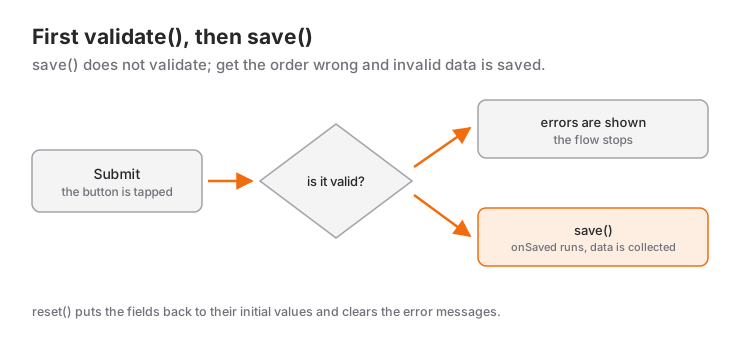
The point people mix up most: save() does not validate. So the order is always validate() first, then save():
String? _email;

TextFormField(
  onSaved: (value) => _email = value,
)

// When the form is submitted
if (_formKey.currentState!.validate()) {
  _formKey.currentState!.save(); // Calls the onSaved callbacks
  print(_email);
}
There are two ways to read values: write them to a variable in onSaved, or read controller.text from a TextEditingController. Pick one per form. If you need to change the text from code or listen to it live, use a controller; if you only need the value at submit time, onSaved gets you there with less code.
AutovalidateMode
autovalidateMode decides when errors become visible:
Form(
  key: _formKey,
  autovalidateMode: AutovalidateMode.onUserInteraction,
  child: ...
)disabled(default): errors appear only whenvalidate()is called.onUserInteraction: a field validates itself once the user has touched it and started typing.onUnfocus: a field is validated when the user leaves it.always: everything is validated as soon as the screen opens. An empty form that greets the user with red errors is almost never what you want.
One pattern works well in practice: start the form as disabled and switch to onUserInteraction after the first failed submit. The user isn't scolded before typing anything, yet sees the red text disappear the moment the mistake is fixed. The mini scenario below uses exactly this.
Focus Handling and textInputAction
textInputAction sets what the keyboard's bottom-right key says. With TextInputAction.next, Flutter moves focus to the next field by itself; you don't need a FocusNode for that. On the last field, use TextInputAction.done and call your submit function in onFieldSubmitted, and the user can finish the whole form without leaving the keyboard.
A FocusNode is needed when you want to move focus out of order, jump to the first invalid field, or listen to focus changes. If you create one, it must be closed in dispose(), just like a controller.
When to Use It and When Not To
Reach for Form when two or more fields are validated together and submitted together: login, sign-up, address, payment, profile editing.
It is unnecessary here:
- A single search box or chat input: there is nothing to validate; a plain
TextFieldwithonChangedor a controller is enough. - Settings that apply instantly: if a Switch or Slider saves the moment it changes, there is no "submit" step and no need for a Form.
Form is not limited to text fields. For a drop-down, use DropdownButtonFormField instead of a plain DropdownButton; widgets such as a checkbox can join the same validate() call by wrapping them in a FormField<T>:
FormField<bool>(
  initialValue: false,
  validator: (value) =>
      value == true ? null : 'You must accept to continue',
  builder: (state) => Column(
    crossAxisAlignment: CrossAxisAlignment.start,
    children: [
      CheckboxListTile(
        value: state.value,
        onChanged: state.didChange,
        title: const Text('I accept the terms of use'),
      ),
      if (state.hasError)
        Text(
          state.errorText!,
          style: TextStyle(color: Theme.of(context).colorScheme.error),
        ),
    ],
  ),
)
Common Mistakes
1. Creating the controller inside build and never disposing it
Symptom: every time the screen rebuilds, the typed text vanishes or the cursor jumps to the start. The cause is a TextEditingController() line inside build; each rebuild gives birth to a brand-new controller. The controller belongs in the State class as a field and must be closed in dispose():
class _ProfileFormState extends State<ProfileForm> {
  final _nameController = TextEditingController();

  @override
  void dispose() {
    _nameController.dispose();
    super.dispose();
  }
  // ...
}
A controller that is never disposed stays in memory after the screen is gone. I cover the order of initState and dispose in detail in the StatefulWidget life cycle post.
2. Using TextField inside a Form
Symptom: validate() always returns true, even when the field is empty. A TextField never registers itself with the Form; it doesn't even have a validator parameter. Every text field that should be validated inside a Form has to be a TextFormField.
3. Creating the GlobalKey in build, or forgetting to pass it to the Form
If the key is never assigned with Form(key: ...), the line _formKey.currentState! crashes with "Null check operator used on a null value". If the key is created inside build, the form's state is reset on every rebuild: error messages disappear and the keyboard closes. Like a controller, the GlobalKey should be created once as a State field.
4. The form overflows when the keyboard opens
Symptom: the yellow-and-black stripes with "Bottom overflowed by ... pixels" once the keyboard is up. The fix is to put the form's Column inside a SingleChildScrollView, so the lower fields can be scrolled into view while the keyboard is open. Details are in the SingleChildScrollView post.
Mini Scenario: A Login Form
Let's put the pieces together: a login form with email and password, where the keyboard's "next" and "done" keys drive the flow and the button locks while submitting:
class LoginForm extends StatefulWidget {
  const LoginForm({super.key});

  @override
  State<LoginForm> createState() => _LoginFormState();
}

class _LoginFormState extends State<LoginForm> {
  final _formKey = GlobalKey<FormState>();
  final _emailController = TextEditingController();
  final _passwordController = TextEditingController();
  AutovalidateMode _autovalidateMode = AutovalidateMode.disabled;
  bool _isSubmitting = false;

  @override
  void dispose() {
    _emailController.dispose();
    _passwordController.dispose();
    super.dispose();
  }

  Future<void> _submit() async {
    if (!_formKey.currentState!.validate()) {
      // After the first failed attempt, update errors while typing
      setState(() => _autovalidateMode = AutovalidateMode.onUserInteraction);
      return;
    }
    FocusScope.of(context).unfocus(); // Close the keyboard
    setState(() => _isSubmitting = true);
    await Future.delayed(const Duration(seconds: 1)); // Stands in for a server call
    if (!mounted) return;
    setState(() => _isSubmitting = false);
    ScaffoldMessenger.of(context).showSnackBar(
      SnackBar(content: Text('Welcome, ${_emailController.text.trim()}')),
    );
  }

  @override
  Widget build(BuildContext context) {
    return Form(
      key: _formKey,
      autovalidateMode: _autovalidateMode,
      child: Column(
        children: [
          TextFormField(
            controller: _emailController,
            decoration: const InputDecoration(labelText: 'Email'),
            keyboardType: TextInputType.emailAddress,
            textInputAction: TextInputAction.next,
            autofillHints: const [AutofillHints.email],
            validator: validateEmail,
          ),
          const SizedBox(height: 12),
          TextFormField(
            controller: _passwordController,
            decoration: const InputDecoration(labelText: 'Password'),
            obscureText: true,
            textInputAction: TextInputAction.done,
            onFieldSubmitted: (_) => _submit(),
            validator: validatePassword,
          ),
          const SizedBox(height: 20),
          FilledButton(
            onPressed: _isSubmitting ? null : _submit,
            child: _isSubmitting
                ? const SizedBox(
                    width: 20,
                    height: 20,
                    child: CircularProgressIndicator(strokeWidth: 2),
                  )
                : const Text('Sign In'),
          ),
        ],
      ),
    );
  }
}
Three details are worth noticing. First, passing null to onPressed disables the button, so the user cannot send the request twice. Second, the if (!mounted) return; line after the await stops us from calling setState on a widget that was closed while we were waiting. Third, the message used to report the result is explained in the SnackBar post.
Frequently Asked Questions
What is the difference between validate() and save()?
validate() runs the validator functions of all fields and returns true if the form is valid. save() only calls the onSaved callbacks and checks nothing. That is why you call validate() first and save() only when it returns true.
What is the difference between TextField and TextFormField?
TextFormField is a TextField integrated with Form: it has validator, onSaved and autovalidateMode parameters and takes part in the form's validate() call. For a standalone input that needs no validation, TextField is enough.
How do I update error messages while the user is typing?
Set autovalidateMode to AutovalidateMode.onUserInteraction on the Form or on a single field. Starting the form as disabled and switching to this mode after the first failed submit avoids showing errors on an empty form.
Do I have to use a TextEditingController?
No. If you only read the value at submit time, onSaved is enough. Use a controller when you need to change, clear or listen to the text from code, and close it in dispose().
Related Posts
Flutter: Using TextField and TextEditingController
Flutter TextField guide: TextEditingController and dispose, InputDecoration, keyboard types, inputFormatters, password fields, FocusNode and onChanged.
Flutter: DropdownButton Usage and Features
Flutter DropdownButton and DropdownButtonFormField, the Material 3 DropdownMenu, a dependent dropdown scenario and the value assertion fix.
Flutter: Light and Dark Themes with ThemeData
Building a Flutter theme with ThemeData: ColorScheme.fromSeed, light and dark themes, ThemeMode, reading with Theme.of, TextTheme, component themes, extensions.