Flutter: Using FloatingActionButton (FAB)
Last updated:
7 min read

The FloatingActionButton (FAB) is the button that floats above the content and stands for the single most important action on a screen: "new note" in a notes app, "compose" in a mail client, "my location" on a map. It is the first thing the eye lands on, which makes choosing what the FAB does a bigger decision than choosing its color. This post covers the basics plus the Material 3 sizes, positioning, hiding the button while scrolling, and the heroTag error that almost everyone hits once.
Live Demo
You can try this widget in the interactive example below:
💡 If the example above doesn't load, click DartPad to run it in a new tab.
Basic Usage
The FAB goes into the floatingActionButton parameter of Scaffold. The Scaffold positions it, pushes it up when a SnackBar appears and animates it across page transitions, so use this parameter rather than placing the button in a Stack by hand.
Scaffold(
  appBar: AppBar(title: const Text('FAB Example')),
  body: const Center(child: Text('Hello Flutter')),
  floatingActionButton: FloatingActionButton(
    onPressed: () {
      debugPrint('FAB tapped!');
    },
    tooltip: 'Add', // Shown on long press and read by screen readers
    child: const Icon(Icons.add),
  ),
)
In Material 3 the default FAB color is the theme's primaryContainer, with onPrimaryContainer for the icon. If your theme is set up properly, you get a matching button without specifying a single color.
Sizes: small, regular, large and extended
Material 3 gives the FAB three sizes and one variant with a label, each as its own constructor:
FloatingActionButton.small(onPressed: () {}, child: const Icon(Icons.edit)),
FloatingActionButton(onPressed: () {}, child: const Icon(Icons.add)),
FloatingActionButton.large(onPressed: () {}, child: const Icon(Icons.navigation)),
FloatingActionButton.extended(
  onPressed: () {},
  icon: const Icon(Icons.add),
  label: const Text('New Task'),
),
small is meant for a secondary action, large for an action that is practically the whole point of the screen (the shutter in a camera app), and extended for cases where the icon alone is ambiguous. The older mini: true flag still works, but in Material 3 projects FloatingActionButton.small is the preferred spelling.
Customization
Color, shadow and shape can be changed directly on the widget:
FloatingActionButton(
  onPressed: () {},
  backgroundColor: Colors.purple, // Button color
  foregroundColor: Colors.white,  // Icon color
  elevation: 8.0,                 // Shadow depth
  shape: RoundedRectangleBorder(
    borderRadius: BorderRadius.circular(10),
  ),
  child: const Icon(Icons.download),
)
If every FAB in the app should look the same, do not repeat these settings; pass a FloatingActionButtonThemeData to the floatingActionButtonTheme field of ThemeData. Less repetition, and the dark-mode variant lives in one place.
Positioning (floatingActionButtonLocation)
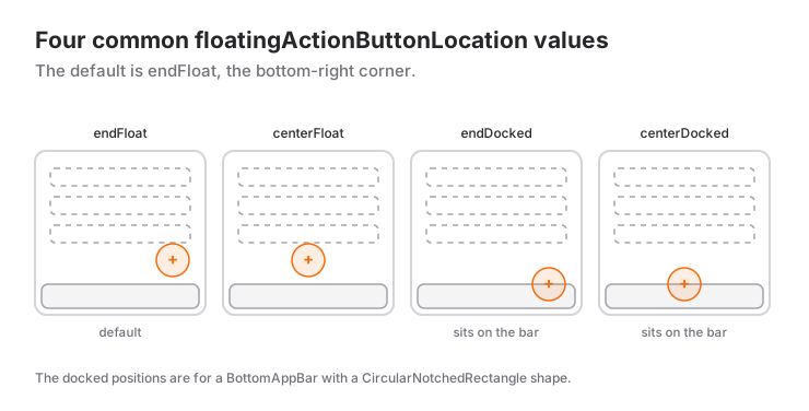
The position is set through the floatingActionButtonLocation parameter of Scaffold. The default is endFloat, the bottom-right corner.
Scaffold(
  floatingActionButtonLocation: FloatingActionButtonLocation.centerDocked,
  floatingActionButton: FloatingActionButton(
    onPressed: () {},
    child: const Icon(Icons.add),
  ),
  bottomNavigationBar: BottomAppBar(
    shape: const CircularNotchedRectangle(), // Cuts a notch for the FAB
    child: Row(
      children: [
        IconButton(onPressed: () {}, icon: const Icon(Icons.menu)),
        const Spacer(),
        IconButton(onPressed: () {}, icon: const Icon(Icons.search)),
      ],
    ),
  ),
)
Commonly used values:
| Value | Position |
|---|---|
endFloat |
Bottom right (default) |
centerFloat |
Bottom center |
startFloat |
Bottom left |
endDocked, centerDocked |
Embedded in a BottomAppBar with a notch |
endContained |
Inside the BottomAppBar, no notch (Material 3 style) |
endTop, miniEndTop |
Attached to the bottom edge of the AppBar |
The notched (docked) look was a Material 2 signature; in Material 3 the endContained location, where the FAB sits inside the BottomAppBar without a notch, looks more current.
Hiding the FAB While Scrolling
On long lists the usual way to keep the FAB from covering content is to hide it while scrolling down and bring it back when scrolling up. We listen to the scroll direction with NotificationListener<UserScrollNotification> and animate visibility with AnimatedScale:
import 'package:flutter/rendering.dart'; // for ScrollDirection

bool _fabVisible = true;

bool _onScroll(UserScrollNotification n) {
  if (n.direction == ScrollDirection.reverse && _fabVisible) {
    setState(() => _fabVisible = false); // Scrolling down: hide
  } else if (n.direction == ScrollDirection.forward && !_fabVisible) {
    setState(() => _fabVisible = true);  // Scrolling up: show
  }
  return false; // Let the notification keep bubbling up
}

// inside build:
floatingActionButton: AnimatedScale(
  scale: _fabVisible ? 1 : 0,
  duration: const Duration(milliseconds: 200),
  child: FloatingActionButton(onPressed: _add, child: const Icon(Icons.add)),
),
ScrollDirection.reverse sounds backwards: when the content moves up (the user drags a finger upwards) the scroll offset grows, and Flutter calls that "reverse".
When to Use It and When Not To
- Use it when the screen has one primary, constructive action (create, add, compose, send). This is where the one-FAB-per-screen rule comes from; with two FABs it is no longer clear which action is the main one.
- Don't use it for destructive actions (delete, sign out). Those belong in a menu or inside the list item, guarded by an AlertDialog.
- Don't use it when several actions have equal weight. The right home is the
actionslist of theAppBaror a PopupMenuButton. - Don't use it for the result of a form. A sign-up form's "Submit" button belongs in the flow, below the fields; a floating button is harder to find there.
- Don't use it when the screen already has a
BottomNavigationBaror a tall bottom sheet that the FAB would collide with. Move it into aBottomAppBarwithendContained, or drop it.
Common Mistakes
1. Two FABs on one screen: the heroTag clash
Symptom: the app crashes to the red error screen during a page transition: "There are multiple heroes that share the same tag within a subtree."
Cause: every FAB wraps itself in a Hero, and they all share the same default heroTag. With two FABs on one screen (or in separate Scaffolds inside an IndexedStack), Flutter cannot tell which one to fly. The mechanism is explained in detail in the Hero animation post, together with the common Hero errors.
Fix: give each FAB a distinct heroTag, or pass null to turn the animation off:
Column(
  mainAxisAlignment: MainAxisAlignment.end,
  children: [
    FloatingActionButton.small(
      heroTag: 'refresh',
      onPressed: () {},
      child: const Icon(Icons.refresh),
    ),
    const SizedBox(height: 12),
    FloatingActionButton(
      heroTag: null, // Disables the Hero animation entirely
      onPressed: () {},
      child: const Icon(Icons.add),
    ),
  ],
)
2. The FAB covers the last list item
Symptom: scrolled to the bottom, the right side of the last row sits under the FAB and its button or text cannot be tapped.
Fix: leave room at the end of the list. Passing EdgeInsets.only(bottom: 88) to the padding parameter of ListView is enough; hiding the FAB on scroll, as shown above, is a nice addition.
3. The FAB looks faded and does nothing
Symptom: the button is gray and tapping it has no effect.
Cause: onPressed is null. Just like ElevatedButton, a FAB with a null callback is disabled. Usually this comes from a condition such as onPressed: _isLoading ? null : _save where the loading flag never gets reset.
Fix: make sure the flag is cleared on every path; setState(() => _isLoading = false) inside try/finally is the safest spot.
4. You expected a circle and got rounded corners
Symptom: after switching to Material 3 the FAB became "square".
Cause: in the Material 3 design language the default FAB shape is a rounded square. This is not a bug, it is the new default.
Fix: if you want the circle back, pass shape: const CircleBorder(), or apply it app-wide through floatingActionButtonTheme.
Mini Scenario: A Reminders Screen
Picture a list of reminders. The screen has one action, adding a reminder: tapping the FAB opens a date picker, the chosen date goes into the list, and a notification with an "Undo" option appears. While the list scrolls, the FAB hides.
import 'package:flutter/material.dart';
import 'package:flutter/rendering.dart';

class RemindersScreen extends StatefulWidget {
  const RemindersScreen({super.key});

  @override
  State<RemindersScreen> createState() => _RemindersScreenState();
}

class _RemindersScreenState extends State<RemindersScreen> {
  final List<DateTime> _reminders = [];
  bool _fabVisible = true;

  bool _onScroll(UserScrollNotification n) {
    if (n.direction == ScrollDirection.reverse && _fabVisible) {
      setState(() => _fabVisible = false);
    } else if (n.direction == ScrollDirection.forward && !_fabVisible) {
      setState(() => _fabVisible = true);
    }
    return false;
  }

  Future<void> _addReminder() async {
    final today = DateTime.now();
    final date = await showDatePicker(
      context: context,
      initialDate: today,
      firstDate: today,
      lastDate: DateTime(today.year + 1),
    );
    if (date == null || !mounted) return;

    setState(() => _reminders.insert(0, date));

    ScaffoldMessenger.of(context)
      ..hideCurrentSnackBar()
      ..showSnackBar(
        SnackBar(
          content: const Text('Reminder added'),
          action: SnackBarAction(
            label: 'Undo',
            onPressed: () => setState(() => _reminders.remove(date)),
          ),
        ),
      );
  }

  @override
  Widget build(BuildContext context) {
    final loc = MaterialLocalizations.of(context);
    return Scaffold(
      appBar: AppBar(title: const Text('Reminders')),
      body: NotificationListener<UserScrollNotification>(
        onNotification: _onScroll,
        child: ListView.builder(
          padding: const EdgeInsets.only(bottom: 88), // Keep the last row clear of the FAB
          itemCount: _reminders.length,
          itemBuilder: (_, i) => ListTile(
            leading: const Icon(Icons.alarm),
            title: Text(loc.formatFullDate(_reminders[i])),
          ),
        ),
      ),
      floatingActionButton: AnimatedScale(
        scale: _fabVisible ? 1 : 0,
        duration: const Duration(milliseconds: 200),
        child: FloatingActionButton.extended(
          onPressed: _addReminder,
          icon: const Icon(Icons.add_alarm),
          label: const Text('Add Reminder'),
        ),
      ),
    );
  }
}
Three decisions are baked in here. First, the button is extended: a bare "+" does not answer "a reminder or a note?", the label does. Second, the mounted check after the date picker; showDatePicker is a dialog, so the page may have been closed during the await, as explained in the DatePicker post. Third, feedback comes through a SnackBar rather than a dialog: adding is reversible, so there is no reason to interrupt the user. The hideCurrentSnackBar call keeps notifications from queueing up when several reminders are added in a row.
Frequently Asked Questions
Why do I get "There are multiple heroes that share the same tag"?
When a screen contains more than one FloatingActionButton, they all carry the same default heroTag, and during a page transition the Hero system cannot tell which one to animate. Give each FAB a distinct heroTag, or disable the animation with heroTag: null.
Can a screen have more than one FAB?
Technically yes, but the design guidance is one primary action per screen. If a second action is needed, mark it as secondary with FloatingActionButton.small or move it into the AppBar.
How do I hide the FAB while scrolling?
Wrap the list in a NotificationListener<UserScrollNotification>, keep a visibility flag based on its direction field, and place the FAB inside an AnimatedScale or AnimatedSlide driven by that flag.
When should I prefer FloatingActionButton.extended?
When the icon alone is ambiguous or when showing the action's name helps people take it. If the text is long or the screen is narrow, a regular FAB with a tooltip stays cleaner.
Related Posts
Flutter: BottomSheet and showModalBottomSheet
Flutter's showModalBottomSheet: returning values, isScrollControlled, useSafeArea, showDragHandle, keyboard insets, DraggableScrollableSheet, persistent sheets.
Flutter: Card Widget and Design Usage
Flutter Card guide: Material 3 Card.filled and Card.outlined, clipBehavior with images, tappable cards with InkWell, common mistakes and a product card.
Flutter: AppBar Widget and Customization
A practical Flutter AppBar guide: title, leading, actions and bottom, the Material 3 scrolled-under color change, and fixes for common mistakes.