Flutter: Fine Alignment Operations with Align Widget
Last updated:
7 min read

Align places a single child at the point you choose inside the space it occupies: the top-right corner, the bottom center, or an in-between spot such as "seventy percent to the right, slightly above the middle". Center is really an Align pinned to alignment: Alignment.center; Align goes beyond the nine presets with a coordinate system from -1 to 1. In this post I cover that coordinate system, the FractionalOffset alternative, how widthFactor/heightFactor change Align's own size, and how to choose between Align and Positioned inside a Stack.
Live Demo: Align Widget Examples
You can try different alignment values in the interactive example below:
💡 If the example above doesn't load, click DartPad to run it in a new tab.
Basic Usage
Container(
  width: 300,
  height: 200,
  color: Colors.grey.shade200,
  child: Align(
    alignment: Alignment.topRight,
    child: Icon(Icons.close, color: Colors.red),
  ),
)
Align does two things: first it decides its own size (here it fills the 300x200 area the Container provides), then it positions its child inside that area according to alignment. The child keeps its natural size; Align never enlarges it.
The Alignment Coordinate System
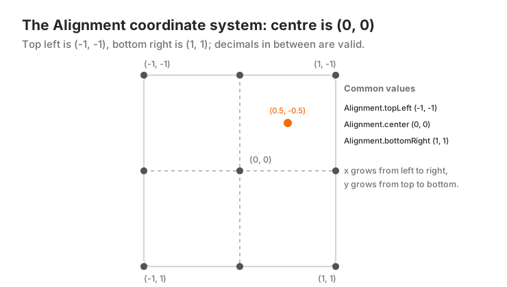
Alignment(x, y) takes two numbers, both between -1 and 1. For x, -1 is the left edge, 0 the center and 1 the right edge; for y, -1 is the top, 0 the center and 1 the bottom. The nine preset constants are shorthands for these values:
Alignment.topLeft      // Alignment(-1, -1)
Alignment.topCenter    // Alignment( 0, -1)
Alignment.topRight     // Alignment( 1, -1)
Alignment.centerLeft   // Alignment(-1,  0)
Alignment.center       // Alignment( 0,  0)
Alignment.centerRight  // Alignment( 1,  0)
Alignment.bottomLeft   // Alignment(-1,  1)
Alignment.bottomCenter // Alignment( 0,  1)
Alignment.bottomRight  // Alignment( 1,  1)
In-between values are valid too: Alignment(0.5, 0) puts the child horizontally halfway between the center and the right edge, and Alignment(0, 0.8) gives a spot near the bottom without touching it. The value is a fraction of the space that remains after the child's size is subtracted, which is why 1 always means "flush against the edge" no matter how many pixels the child measures.
Going outside the range is not forbidden: Alignment(1.5, 0) pushes the child partly out on the right. That can be useful in a slide animation, but unless the parent clips (clipBehavior), the overflowing part is painted over neighbouring widgets.
For right-to-left languages, constants such as AlignmentDirectional.topStart and centerEnd flip themselves according to Directionality; if a close button should always sit where the text ends, use these instead of the physical topRight.
FractionalOffset: From 0 to 1
If you prefer to think from 0 to 1, there is FractionalOffset(dx, dy): (0, 0) is top-left, (0.5, 0.5) the center and (1, 1) bottom-right. When a design file says "30% from the left", FractionalOffset(0.3, 0) is written directly with no need to convert it into Alignment(-0.4, -1). Both are AlignmentGeometry types; the alignment parameter accepts either.
Align's Own Size: widthFactor and heightFactor
Align's size follows three rules:
- If the parent bounds that axis, Align takes the largest size it can.
- If the parent is unbounded on that axis (the horizontal axis of a Row, the vertical axis of a Column), Align shrinks to its child.
- If
widthFactororheightFactoris set, Align becomes that multiple of the child's size on that axis, overriding rule 1.
Align(
  alignment: Alignment.topLeft,
  widthFactor: 2.0,  // Align width = child width x 2
  heightFactor: 1.5, // Align height = child height x 1.5
  child: SizedBox(width: 50, height: 50, child: ColoredBox(color: Colors.blue)),
)
This Align measures 100x75 and does not grow however large the parent is. It is used for leaving space proportional to the child around a widget, or for showing half of a box. You rarely need these parameters, but rules 1 and 2 are in effect for every Align you write; most of the mistakes below come from them.
Align Inside a Column
A Column gives its children bounded width (the Column's width) and unbounded height. So an Align inside a Column is full width and as tall as its child, which makes it the cleanest way to push a single child to the right or left:
Column(
  crossAxisAlignment: CrossAxisAlignment.stretch,
  children: [
    const TextField(decoration: InputDecoration(labelText: 'Password')),
    Align(
      alignment: Alignment.centerRight,
      child: TextButton(onPressed: () {}, child: const Text('Forgot password?')),
    ),
  ],
)
crossAxisAlignment affects every child; Align affects only the one it wraps. How space and stretch interact is covered in more depth in the mainAxisSize post.
Align or Positioned Inside a Stack?
A Stack's non-positioned children are placed according to Stack.alignment; with Align you can give each child its own position. Positioned works with pixel values such as top and right; how a Stack sizes itself and the whole Positioned family are covered in the Stack and Positioned post. Choose like this:
- If the position is proportional ("top-right corner", "bottom center"), Align.
- If the position is in pixels ("8 from the top, 8 from the right") or the child must hang outside the Stack (a badge with
clipBehavior: Clip.none), Positioned. - If the Stack has no definite size (mistake 1 below), Positioned is safer because it does not take part in the Stack's size calculation.
When to Use It and When Not To
Reach for Align:
- To pin a single child to a corner or edge of its parent.
- For in-between positions (
Alignment(0.7, -0.2)and the like); no other widget gives you that in one line. - To push one child in a Column to the right or left.
Switch to another tool:
- For pure centering,
Center; the same thing, more readable. - For pixel offsets,
Positioned(inside a Stack) orTransform.translate(anywhere). - If a Container is already there,
Container(alignment: ...); it builds the same Align internally. - To align all children at once, the
mainAxisAlignmentandcrossAxisAlignmentparameters of Row and Column.
Common Mistakes
1. Align inside a Stack inflates the whole Stack
Symptom: the badge you meant to put on the corner of an icon ends up at the far right of the screen. A Stack is as large as its biggest non-positioned child. Because Align chooses to be "as large as possible" in a bounded area, the Stack stretches to the full width the parent offers, and the badge goes to the corner of that width.
// Wrong: the Align stretches the Stack to full width
Stack(
  children: [
    const Icon(Icons.notifications, size: 32),
    Align(alignment: Alignment.topRight, child: _Badge()),
  ],
)

// Right: give the Stack a concrete size...
SizedBox(
  width: 40,
  height: 40,
  child: Stack(
    children: [
      const Align(alignment: Alignment.bottomLeft, child: Icon(Icons.notifications, size: 32)),
      Align(alignment: Alignment.topRight, child: _Badge()),
    ],
  ),
)

// ...or use Positioned, which does not count towards the Stack's size
Stack(
  clipBehavior: Clip.none,
  children: [
    const Icon(Icons.notifications, size: 32),
    Positioned(top: -4, right: -4, child: _Badge()),
  ],
)
Material 3 also ships a ready-made Badge widget; consider it first for badges.
2. Reading Alignment(0.5, 0) as "50% from the left"
Symptom: the child sits further right than expected. In Alignment, 0 is the center; 0.5 is halfway between the center and the right edge, which is 75% from the left. If you think in percentages, write FractionalOffset(0.5, 0).
3. Align inside a Row does not align
Symptom: you put Align(alignment: Alignment.centerRight, child: Text(...)) in a Row and the text did not move. Row gives unbounded width; the Align shrinks to its child and has no room left to align within. Fix: wrap the Align in Expanded, or use the Row's mainAxisAlignment. Why Expanded is required is explained in the Expanded post.
Mini Scenario: Image Card
Picture 200 pixel tall image cards in a recipe app: a favorite button at the top right and a duration label at the bottom left. Since the Stack's size is fixed by a SizedBox, Align fits perfectly here.
class RecipeImageCard extends StatelessWidget {
  const RecipeImageCard({super.key, required this.imageUrl, required this.duration});

  final String imageUrl;
  final String duration;

  @override
  Widget build(BuildContext context) {
    return SizedBox(
      height: 200,
      child: Stack(
        fit: StackFit.expand,
        children: [
          Image.network(imageUrl, fit: BoxFit.cover),
          Align(
            alignment: Alignment.topRight,
            child: IconButton.filledTonal(
              onPressed: () {},
              icon: const Icon(Icons.favorite_border),
            ),
          ),
          Align(
            alignment: const Alignment(-0.9, 0.85),
            child: Chip(
              avatar: const Icon(Icons.schedule, size: 16),
              label: Text(duration),
            ),
          ),
        ],
      ),
    );
  }
}
StackFit.expand makes the image fill the whole card; the two Aligns place their children in the corners. For the label I used Alignment(-0.9, 0.85): it sits slightly inside the edge instead of in the exact corner, with no Padding wrapper needed. When the card width changes, the positions are preserved proportionally; with Positioned I would have needed constants such as left: 12, bottom: 12, which is a valid choice too, but when the design calls for proportional placement Align means less code.
Frequently Asked Questions
What is the difference between Align and Center?
Center is an Align pinned to alignment: Alignment.center; the sizing rules and the widthFactor/heightFactor parameters are identical. If you only want centering, Center reads better; for any other position you need Align.
Should I use Align or Positioned inside a Stack?
Align when the position is proportional and the Stack has a definite size; Positioned when you need pixel values, the child must hang outside the Stack, or the Stack's size is derived from its children. Positioned does not take part in the Stack's size calculation, so it never causes unexpected growth.
Are Alignment and FractionalOffset the same thing?
They do the same job on different scales: Alignment runs from -1 to 1 with the center at 0; FractionalOffset runs from 0 to 1 with the top-left corner at 0. Both can be passed to alignment; pick whichever matches your design values directly.
Why is Align larger than its child?
When the parent provides a bounded area, Align fills all of it; alignment only makes sense when there is such empty space. If you want Align sized to its child, pass widthFactor: 1 and heightFactor: 1, or place it in an unbounded parent.
Related Posts
Flutter: Detailed Usage of Center Widget
How Center relates to Align, why it fills the available space, widthFactor, why it does not center vertically in a Column, and the common mistakes.
Flutter: Layering Widgets with Stack and Positioned
Flutter Stack and Positioned guide: how a Stack sizes itself, fit, alignment, clipBehavior, Positioned.fill, PositionedDirectional, badge and overlay recipes.
Flutter: Inner Space Management with Padding
Every EdgeInsets constructor, EdgeInsetsDirectional for RTL, SafeArea and keyboard insets, the mistakes that overflow or crash, and a login form example.