What Is Claude Design? Seven Levels of AI Design
Last updated:
10 min read
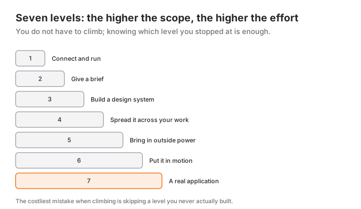
Everyone who tells an AI "design me a nice website" gets the same thing back: purple gradient, centered headline, three-column feature box. The problem is not that the model lacks ability; it is that the input you gave it is identical to everyone else's. In this article I take Claude Design level by level, through seven of them — what you get at each level, which mistake keeps you stuck there, and what it takes to move up one.
The seven-level framework comes from Jack Roberts's video Every Level of Claude Design Explained. This article summarizes and expands on it; the advice on which level to aim for, the common mistakes and the linked articles are additions of this post.
What is Claude Design?
Claude Design is the design workspace inside Claude. Instead of asking for code in a chat window and picturing the result in your head, it gives you an interface where you see the design directly and talk about it. Websites, interface drafts, posters, presentations, HTML emails, motion graphics — all of it comes out of the same place.
The genuinely critical feature is this: it can build a design system and make everything you produce afterwards conform to it. Every level below revolves around that single idea.
Level 1: Plug in and run
At this level you give the tool a one-sentence request: "make an interface draft for a brand that sells teddy bears." It asks you a few questions (target audience, desktop or mobile, brand name), then produces a result.
The result is not bad, but it has no character. And it is important to see the mistake here: everyone using the same system and the same prompt gets the same output. If you supply nothing specific, generic is exactly the expected result. I collected the tells that give away a generic output one by one in what AI slop is.
Still, do not look down on this level. As the video points out, some of the simple marketing sites that sell for hundreds of dollars on freelance marketplaces are about this quality. Even level 1 can save time and money.
To move up: accept that the reason the output is generic is the input.
Level 2: Briefing it like an art director
Two things change at this level: you give it a reference, and you stop trying to finish in one go.
Giving a reference means taking a screenshot of a design you like and saying "use this as the reference." Sites like Pinterest, Awwwards, Mobbin, Godly and Land-book are made for exactly this. The difference is not subtle: the video shows the same request with and without a reference side by side, and the two results do not look like they came out of the same tool.
The second part is iteration. Instead of accepting the first output, you push on it: "make confetti fire when a button is selected," "give each screen's top band a different color," "raise the contrast between the black and the blue." Five or ten rounds of conversation is normal.
The rule of this level: don't try to nail it in one shot. Direct it, then correct it.
Its limit: you are still doing every job one at a time. It is slow and it does not repeat.
Level 3: Building a design system
If you have no design system, you are effectively working with a new designer on every project, renegotiating everything from scratch. A system means having one designer who says "here is how we do things."
In practice the flow goes like this: you export an output you like as a project archive, choose "create a design system" from the main screen, upload the file you downloaded along with any logo, typeface or brand assets you have, and start the generation.
What comes out is a full document covering the color palette, typography, content principles, image treatments and motion rules. According to the video, this is the kind of deliverable businesses pay agencies thousands of dollars for.
A small tactic from the video for the palette: rather than inventing colors from scratch, use palettes that already exist and already work together. Generators like Coolors are good for inspiration, but taking a palette that is already settled is usually the safer bet.
Once you have built it, always export it. Keep the system as a single file you hold; its real value is in being portable.
Level 4: Spreading the system across all your work
Building a design system and then using it on a single website is the most common waste there is. The same system can drive your presentations, your emails, your proposal documents and your social media graphics.
At this level, requests like "put together a sponsorship deck," "design a welcome email," or "improve the color-and-typography pairings in this system" all feed off the same system, and the brand comes out consistent. A deck generated in one shot getting the color scheme right is no longer unusual.
Iteration still applies: you settle the template with corrections like "keep the color band the same height on every slide" or "no sentence runs past two lines." After that, the template sticks.
Level 5: Bringing in outside power
Up to here the tool could only reproduce what it saw. At level five you start generating your own images and video: logos, custom illustration, background video, character art.
The logic here is a split job: Claude works as the design intelligence, and an image generation tool works as the production engine. Claude thinks through what should be asked for and describes it better; the image model produces it. Wire the two together over the command line and feed your design system in as input, and the images that come out belong to your brand — the stock-image feeling disappears. In the video this link is made with Higgsfield's command-line tool (CLI); another image generation service works on the same principle.
Level 6: Putting it in motion
Level six is where you leave static design behind and add motion: HTML animations, sections that respond to scrolling, 3D objects.
With a single request like "make an HTML animation about how habits change over time," you can get a working animation. These can be embedded in a website, used in content, or turned into a reward screen inside an app.
Motion is the biggest factor in a page going from feeling AI-generated to feeling alive. Overdo it, though, and the page tires the visitor in the first second — tie every animation to a purpose, never use it as decoration. I wrote about extending this kind of production all the way to icons and data visuals in motion graphics and icon automation.
Level 7: A real application
At the last level the design is no longer just visual; behind it sits a working application with a database, user sign-up and login. The design system on the Claude Design side joins with development on the Claude Code side, and a service like Supabase takes over the data side.
What makes the work easier here is using an agent skill: upload a skill file that explains how Supabase works, and the model stops guessing — it actually knows the infrastructure. The sign-up form, the login screen and the admin panel can come out of a single request. For how work at this level actually makes it all the way to the store, see how I built Recapday from idea to store.
A small detail that trips up everybody: on a newly created sign-up flow, email confirmation is on by default, so your first login attempt fails. Turn it off while you are testing and turn it back on before you ship.
Also interrogate the security side at this level: run the database advisors and check for row-level security gaps and whether leaked-password protection is switched off. Producing an app that looks beautiful and leaves authorization wide open is easy — and dangerous.
Three expensive mistakes people make moving up
Three mistakes come up again and again when people move up the levels. All three cost time, and all three are easy to avoid.
1. Building the system out of generic output. You build the design system at level three, but the input you feed it is an ordinary level-one design. The result: you have made the ordinariness permanent, and now every piece of work conforms to it. Get an output you genuinely like before you build the system.
2. Skipping iteration and trying to skip levels. The rule of level two was not to finish in one shot. Move up without acquiring that habit and you make the same mistake with the more expensive tools of the higher levels — at a higher price.
3. Forgetting to export the system. Building a design system and leaving it sitting inside the workspace is the most frustrating loss there is. The entire value of a system is portability — it should be in your hands as a single file so that you can take it to other projects, other tools and client work.
There is a quieter mistake too: not knowing which level you are on. Using level-five tools without having a level-three system ends with images that do not match each other. Solidify the step below first.
Which level should you stay on?
You do not have to climb all seven. A rough rule of thumb:
- If you produce a few images a month, level 2 is enough.
- If you have a brand and produce recurring output, levels 3–4 are where the real gain is. This is where the investment pays back fastest.
- Levels 5–6 make sense for people producing content and doing client work.
- Move to level 7 only if you genuinely have a product going live; otherwise the maintenance burden outweighs the gain.
One cost warning too: the multi-step, critic-driven flows at the higher levels eat serious tokens. Use them on the templates you will reuse over and over, not on every job.
In short
What makes the difference in Claude Design is not using the model better, it is building the system. The people who stay at level one conclude the tool is incompetent; the people who get to level three pull completely different work out of the same tool. The only difference between them is having sat down once and built a design system.
Frequently Asked Questions
I don't know design — can I still use it?
Yes, but "not knowing design" and "not knowing what you want" are different things. The tool draws for you; it cannot decide for you. Learning to gather references — collecting the designs you like and being able to describe what you like about them — gets you to level two on its own.
How long does building a design system take?
If you already have an output you like, the first version comes out in minutes. Getting it to really settle takes a few rounds of correction. The time you spend up front pays you back on every piece of work afterwards.
Won't everything end up looking the same?
That is precisely the point of a design system — consistency. The place you want variety is not the system itself but the variations inside it: different layouts within the same palette, different compositions with the same typography.
Can I use what I produce commercially?
You can use the output you generate, but be careful about the design you took as a reference. "Taking inspiration" and copying a brand's visual identity one-to-one are different things; the second one is both a legal risk and an obstacle to building your own brand.
Source
- Jack Roberts, Every Level of Claude Design Explained (YouTube, August 2026). The seven-level structure, the example flows and the Supabase steps are based on this video; the advice on choosing a level and the additional explanations belong to this article.
Tool names, menus and features change quickly; check the current documentation before you start.
Related Posts
Consistency in AI Design: The Critic Loop
AI design comes out inconsistent because the model grades its own homework. Here is how an independent critic loop fixes it, and what it costs.
Website Design Audit: Comparing Against a Reference
Can’t explain why your website falls short? Compare it with a strong reference and turn vague impressions into a concrete design audit.
What Is AI Slop? Building a Website That Doesn’t Look AI-Generated
Why does every AI-built website look the same? Here are the symptoms of AI slop and the concrete ways to break it in typography and copy.