AI Motion Graphics: Data, Icons and Automation
Last updated:
9 min read
When you tell an AI "make me an animation," what usually comes back is a graphic that moves but says nothing. And yet with the same tool and the right inputs, you can produce motion graphics that genuinely carry your content. In this article I go through five layers: real data, ready-made assets, your own images, pulling graphics automatically out of video, and the research step that keeps the numbers honest.
This article summarizes and expands on Jack Roberts's video Claude Design FINALLY Solved Motion Graphics. The five-layer flow comes from the video; the timing values, format choices and accessibility sections are additions of this post.
Why does motion graphics come out generic?
The cause is not the animation engine, it is the input. "Make a nice animation" gives the model no constraints at all, so it produces the default: abstract shapes, stock transitions, motion that means nothing. I described the web-design version of those same defaults in what AI slop is.
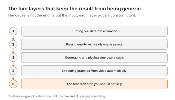
Good motion graphics all have one thing in common: the motion is saying something. A number grows, a comparison appears, a process unfolds step by step. When the motion itself is the goal, the result is decorative and forgettable.
Layer 1: Turning real data into animation
The fastest win is here. If you have concrete numbers, you can feed them straight into an animation: comparative bar charts, values changing over time, share breakdowns.
In practice the request looks like this: you state which items you are comparing, the value of each, the color approach, and any logos you want included. The model turns that into an interactive, animated chart.
The part that really matters comes afterwards: lock in the style you like. Say "use this style for every bar chart from now on," and your charts start to resemble each other — your content acquires a recognizable visual language. That is the difference between producing individually nice charts and owning a consistent chart language. I wrote about how to get that consistency repeated on every run in the critic loop.
Layer 2: Raising quality with ready-made assets
One of the model's weakest areas is drawing icons. And icons are among the elements that raise perceived quality the most.
The fix is to pull the icon from an existing set rather than having the model draw it. Icon libraries and ready-made animation archives (such as Lordicon, shown in the video, including animated icons in Lottie format) exist for this. You collect what you download into a library and hand it to the model as a reference.
Three rules:
- Use one style. Within a presentation or a set of videos, keep the icons from the same family. Mixing styles is more obvious than using a bad icon.
- Check the license. Some are free with attribution, some cost money for commercial use. On client work this is not negotiable.
- Build the library once. Hunting for icons again on every project takes back the time you saved.
Layer 3: Producing and placing your own images
Ready-made assets raise the floor, but they do not make you original. On the third layer you produce your own backgrounds, illustrations and textures and place them inside the animation.
The flow is simple: generate the image you want in an image tool, pick the one you like, bring it into the design environment, and place it in the relevant scene of the animation. In the video's example this generation costs a couple of credits, roughly 12 cents (prices vary by tool and model); in return, the stock feeling disappears. I covered how this step combines with a design system in the seven levels of Claude Design.
Layer 4: Pulling graphics out of video automatically
This is the real win for people producing content, and the least known part.
If you have a video (your own recording or a link), you can ask the model to produce a timestamped transcript — output that maps every word to the second at which it was said. On its own that means nothing, but it makes the next step possible.
In the next step you ask the model this: which moments in this video are worth visualizing? The model scans the speech and comes back with suggestions like "you're making a comparison here, a chart belongs here" or "you're counting off three steps here, a sequenced animation belongs here." Then it produces the graphics for those moments and hands them over along with the timestamps.
As a workflow, that means this: you shoot the video, and the rest largely runs itself. Instead of sitting at the edit and wondering "I should probably put something here," you have the list of suggestions already in hand. If you are going to use this flow constantly, turning it into an agent skill cuts the work down considerably.
Layer 5: The research step you must not skip
This is the step most people skip, and the one that rots the output. If you mention a comparison in the video without saying the numbers out loud, the model has to find those numbers somewhere. If it cannot find them, it makes them up.
So put a research step into the flow: the data going into the chart should be pulled from a real source, and the source should be identified. Scraping tools that fetch only the relevant content rather than a page's raw HTML are both cheap and practical for this; the video uses Firecrawl for this step.
The rule that follows: no number goes into a chart unless its source can be shown. A good-looking wrong chart costs far more than an ugly correct one.
Duration, rhythm and easing
The most common reason motion graphics look amateur is timing. The model will not ask you for these values; if you do not supply them, it uses its defaults. Reasonable ranges to start from:
- Entrance animations: 200-400 ms. Any shorter and nobody notices, any longer and it makes people wait.
- Scene transitions: 400-600 ms.
- Number count-ups: 800-1200 ms. Slow enough for the number to be read, fast enough not to drag.
- Easing: a curve that starts fast and slows down for entrances, the reverse for exits. Linear motion always looks mechanical.
- Staggered sequencing: instead of five elements appearing at once, five elements arriving 60-80 ms apart.
That last one is the cheapest quality you can buy. Bringing elements in sequence rather than all together makes the same design feel completely different.
And one negative rule: no more than two things should move at the same time in a scene. When everything moves, the eye cannot settle anywhere and whatever the graphic was meant to say gets lost.
Choose the format by where it is going
You cannot drop the same graphic everywhere in the same form. Decide where it is going before you start producing:
- Inside a web page: HTML-based output is best — it scales, the file size is small, and the text stays selectable. For lightweight animated icons, the Lottie format fits.
- Social video: export as a video file. 9:16 for vertical content, 1:1 or 4:5 for feed posts.
- Presentations: short loops, built to work without any voiceover.
Be careful with duration too: on social media, a single long graphic scene easily loses the viewer. If what you want to say takes longer, split it into several short scenes rather than one long one.
Motion sensitivity and accessibility
This is a topic that often gets skipped when producing motion graphics. For some users motion is genuinely unpleasant — an effect that goes as far as dizziness and nausea.
On the web there is a standard solution: restrict the animation for users who have turned on the "reduce motion" setting in their operating system (the CSS prefers-reduced-motion media query). Asking for this in the HTML output you produce is enough — you do not have to remove animation entirely; shortening the durations and dropping the large positional moves is usually plenty.
Two more rules:
- No audio that plays automatically. If sound is needed, let the user start it.
- No more than three flashes per second. This is not an aesthetic preference; it is a threshold defined in the WCAG accessibility guidelines because of seizure risk.
With graphics baked into a video you do not have these controls, so avoid fast flashing and high-contrast flicker from the outset.
Where should you stop?
You do not have to build this entire chain for every piece of content. A rough split:
- For a one-off graphic, layer 1 on its own is enough.
- If you produce content regularly, build layer 2 once; it pays you back every time.
- Only build layers 4 and 5 if you are producing more than one video a week. Without that volume underneath it, maintaining the automation costs more than the time it saves.
And one more thing: use animation to support what you are saying, not to hold the viewer's attention. A screen that never stops moving gets boring just as fast as one that never moves at all.
In short
What makes the difference in motion graphics is not animation skill, it is what you feed the animation. Real data, a consistent asset library, your own images and verified numbers — with those four in place, the work comes out fast and it does not look AI-generated.
Frequently Asked Questions
Do I need to learn a separate program for animation?
Not for this workflow. Because the outputs are HTML-based, they run in the browser; you record them and drop them into your video. You only need professional editing software when you need frame-by-frame control.
Can I use the animations I produce commercially?
The parts you produced yourself are fine. What you need to watch is the ready-made assets you brought in: icon sets, off-the-shelf animations and typefaces all come with their own licences.
What is a timestamped transcript good for?
Two things: knowing what you said at which moment so you can put the graphic in the right place, and generating subtitles. The same output feeds both.
What is the most common mistake in data charts?
Using unverified numbers. The second is showing too much data — keep one idea per chart; if you are comparing things, two or three items is enough.
Source
- Jack Roberts, Claude Design FINALLY Solved Motion Graphics (YouTube, August 2026). Turning data into animation, ready-made icon and Lottie assets, image generation, suggesting graphics from a timestamped transcript, and the Firecrawl research step are based on this video; the timing, format and accessibility advice are additions of this article.
Related Posts
What Is Claude Sonnet 5.5? Benchmarks, Cost, Free Plan
Claude Sonnet 5.5 is now the free plan's default model. It scores 70.6% on Terminal-Bench 4.0 at $2 / $10 per million tokens. How it compares.
What Is GPT-6.1 Sol? Price, Performance, Who Can Use It
GPT-6.1 Sol offers near-Astra intelligence at a fifth of the price: $2 / $10. New plan tiers, Ultrafast speed and who can use it, explained.
A 3D Game in One Day: Building BOINGWARD with AI Agents
I started from a Unity design pack and switched to Godot the same morning. Parallel Claude Code sessions produced 148 commits and a playable 3D pogo game.