
Flutter: BottomNavigationBar verwenden
Zuletzt aktualisiert:
7 Min. Lesezeit

BottomNavigationBar ist die Tab-Leiste am unteren Bildschirmrand, mit der zwischen den Hauptbereichen einer App gewechselt wird: drei bis fünf voneinander unabhängige, gleich wichtige Ziele wie Start, Suche, Warenkorb und Profil. Anders als die TabBar oben reagiert sie nicht auf Wischgesten, und sie steht für die obersten Bereiche der App, nicht für die Abschnitte einer einzelnen Seite. In diesem Beitrag zeige ich, wie das Widget richtig verdrahtet wird, warum der Seitenzustand beim Tab-Wechsel verloren geht und warum Symbole beim vierten Eintrag plötzlich „verschwinden“.
Live-Demo
Sie können dieses Widget im interaktiven Beispiel unten ausprobieren:
💡 Falls das Beispiel oben nicht lädt, klicken Sie auf DartPad, um es in einem neuen Tab auszuführen.
Grundlegende Verwendung
Drei Teile sind nötig: ein int, das den gewählten Tab hält, eine Leiste, die diesen Wert als currentIndex liest, und ein setState in onTap, das den Wert aktualisiert. Fehlt eines davon, reagiert die Leiste entweder gar nicht, oder die Markierung bleibt auf dem ersten Eintrag hängen.
class MyHomePage extends StatefulWidget {
  const MyHomePage({super.key});

  @override
  State<MyHomePage> createState() => _MyHomePageState();
}

class _MyHomePageState extends State<MyHomePage> {
  int _selectedIndex = 0;

  static const List<Widget> _pages = [
    HomePage(),
    SearchPage(),
    ProfilePage(),
  ];

  @override
  Widget build(BuildContext context) {
    return Scaffold(
      body: _pages[_selectedIndex],
      bottomNavigationBar: BottomNavigationBar(
        currentIndex: _selectedIndex,
        onTap: (index) {
          setState(() {
            _selectedIndex = index;
          });
        },
        items: const [
          BottomNavigationBarItem(
            icon: Icon(Icons.home),
            label: 'Start',
          ),
          BottomNavigationBarItem(
            icon: Icon(Icons.search),
            label: 'Suche',
          ),
          BottomNavigationBarItem(
            icon: Icon(Icons.person),
            label: 'Profil',
          ),
        ],
      ),
    );
  }
}
Die BottomNavigationBar selbst wechselt nie eine Seite; sie meldet nur „der Nutzer hat Eintrag 2 angetippt“. Welche Seite sichtbar ist, entscheidet body. Diese Trennung ist wichtig, denn der Versuch, Tabs mit Navigator.push zu wechseln, ist ein häufiger Fehler: Tabs legen keine neuen Seiten auf den Stack, sie tauschen den Inhalt innerhalb desselben Scaffold. Stack-basierte Navigation erklärt der Beitrag zum Navigator.
Wichtige Eigenschaften
| Eigenschaft | Beschreibung |
|---|---|
currentIndex |
Index des gewählten Eintrags; gehört in den State |
onTap |
Callback mit dem Index des angetippten Eintrags |
items |
Mindestens zwei BottomNavigationBarItem |
type |
fixed oder shifting |
selectedItemColor |
Farbe des gewählten Eintrags |
unselectedItemColor |
Farbe der übrigen Einträge |
showUnselectedLabels |
Beschriftungen der übrigen Einträge anzeigen |
backgroundColor |
Hintergrundfarbe (gilt für den Typ fixed) |
fixed und shifting im Vergleich
Der Parameter type bestimmt das Verhalten der Leiste, und sein Standardwert hängt von der Anzahl der Einträge ab: bis drei Einträge fixed, ab vier shifting. Diese Regel überrascht Einsteiger mehr als alles andere an diesem Widget.
// fixed: alle Einträge gleich breit, Beschriftungen immer sichtbar
BottomNavigationBar(
  type: BottomNavigationBarType.fixed,
  // ...
)

// shifting: nur die gewählte Beschriftung ist sichtbar, der Hintergrund folgt dem Eintrag
BottomNavigationBar(
  type: BottomNavigationBarType.shifting,
  items: const [
    BottomNavigationBarItem(
      icon: Icon(Icons.home),
      label: 'Start',
      backgroundColor: Colors.indigo, // bei shifting liefert jeder Eintrag seinen Hintergrund
    ),
    // ...
  ],
)
Im Modus shifting sind die nicht gewählten Beschriftungen ausgeblendet, und der Hintergrund der Leiste stammt aus dem backgroundColor des gewählten Eintrags. Geben Sie den Einträgen keine Farbe, entsteht der „Weiß auf Weiß“-Effekt aus dem Abschnitt zu den Fehlern. Für die meisten Apps ist fixed die richtige Wahl; bei vier oder fünf Einträgen schreiben Sie es ausdrücklich hin.
Aktive und inaktive Symbole
Das von Material empfohlene Muster: gefülltes Symbol für den gewählten Eintrag, Umriss-Symbol für die übrigen.
BottomNavigationBarItem(
  icon: Icon(Icons.home_outlined), // Inaktives Symbol
  activeIcon: Icon(Icons.home),    // Aktives Symbol
  label: 'Start',
)
Seitenzustand mit IndexedStack erhalten
Der Ansatz _pages[_selectedIndex] von oben hat einen Preis: Beim Tab-Wechsel wird die vorherige Seite aus dem Widget-Baum entfernt und ihr State-Objekt mit dispose verworfen. Der Text im Suchfeld, die Scrollposition einer Liste, ein geöffneter Filter, alles wird zurückgesetzt; beim Zurückkehren läuft initState, als würde die Seite zum ersten Mal geöffnet. Warum das so ist, erklärt der Beitrag zum Lebenszyklus.
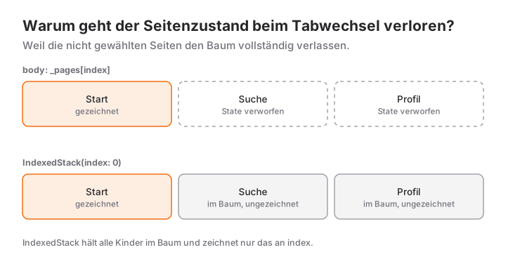
IndexedStack behält alle Kinder im Baum und zeichnet nur das Kind an Position index:
body: IndexedStack(
  index: _selectedIndex,
  children: const [
    HomePage(),
    SearchPage(),
    ProfilePage(),
  ],
)
Der Nachteil: Alle Seiten werden beim App-Start gebaut. Feuert jede Seite in initState eine Netzwerkanfrage ab, laufen alle vier gleichzeitig. Bei leichten Seiten ist das kein Problem; bei schweren lösen Sie das Laden erst aus, wenn die Seite zum ersten Mal sichtbar wird, oder bauen einen kleinen Wrapper, der nur bereits besuchte Tabs erzeugt.
Badge hinzufügen
Um eine Benachrichtigungs- oder Warenkorbzahl in der Ecke eines Symbols zu zeigen, reicht das Badge-Widget aus Material 3:
BottomNavigationBarItem(
  icon: Badge(
    label: Text('3'),
    child: Icon(Icons.notifications),
  ),
  label: 'Mitteilungen',
)
Soll das Badge bei null verschwinden, nutzen Sie Badge.count(count: n, isLabelVisible: n > 0, child: ...); das Szenario unten zeigt es.
Wann verwenden – und wann nicht?
- Verwenden, wenn die App drei bis fünf oberste Bereiche hat, die unabhängig voneinander sind und jederzeit erreichbar sein müssen.
- Nicht verwenden bei mehr als fünf Zielen. Die Einträge werden eng, die Beschriftungen unlesbar. Der Rest gehört in einen Drawer oder hinter einen Tab „Mehr“.
- Nicht verwenden, wenn die Ziele Abschnitte eines einzigen Screens sind („Beschreibung / Bewertungen / Fragen“ eines Produkts). Das ist Aufgabe der oberen
TabBar. - Nicht verwenden für sequenzielle Abläufe (Schritt 1, Schritt 2, Bezahlung). Eine Sequenz läuft auf dem
Navigator-Stack vorwärts; freies Springen zwischen Tabs zerstört sie. - Erwägen Sie die
NavigationBaraus Material 3, die dieselbe Aufgabe erfüllt, wenn Ihr Projekt Material 3 nutzt. Wie Sie sich entscheiden und wie die Umstellung abläuft, behandelt der Vergleich BottomNavigationBar und NavigationBar gesondert. Auf Tablets und Desktops ersetzt eineNavigationRailan der Seite die untere Leiste.
Häufige Fehler
1. Nach dem vierten Eintrag sind die Symbole verschwunden
Symptom: Mit drei Einträgen war alles in Ordnung; nach dem vierten sind die Beschriftungen weg, und im hellen Theme werden die Symbole weiß auf weißem Grund und damit unsichtbar.
Ursache: Ab vier Einträgen springt der Standard-type auf shifting. In diesem Modus fällt die Farbe der Einträge auf die Oberflächenfarbe des Themes zurück (im hellen Theme Weiß), und der Hintergrund kommt aus dem backgroundColor der Einträge; ohne diese Angabe haben Symbole und Hintergrund dieselbe Farbe.
Lösung: type: BottomNavigationBarType.fixed setzen. Wenn Sie wirklich shifting wollen, geben Sie jedem BottomNavigationBarItem ein backgroundColor.
2. Die Markierung bleibt auf dem ersten Tab
Symptom: Tippen wechselt die Seite, aber der markierte Eintrag in der Leiste bewegt sich nie.
Ursache: currentIndex: 0 ist fest eingetragen, oder onTap ruft kein setState auf. Die Leiste merkt sich ihre Auswahl nicht selbst; bei jedem build zeigt sie, was currentIndex sagt.
Lösung: Den Index in einem Feld des State halten, dieses Feld an currentIndex übergeben und in onTap per setState aktualisieren.
3. Die Assertion „items.length >= 2“
Symptom: Die App stürzt beim Start mit 'items.length >= 2': is not true ab.
Ursache: Die Einträge werden aus einer Liste erzeugt, die leer oder einelementig ankam; das Widget verlangt mindestens zwei.
Lösung: Die Leiste bei zu kurzer Liste gar nicht anzeigen (bottomNavigationBar: items.length >= 2 ? BottomNavigationBar(...) : null).
4. Suchtext und Scrollposition werden beim Tab-Wechsel zurückgesetzt
Symptom: Sie tippen etwas im Tab „Suche“, wechseln zu „Profil“, kommen zurück, und das Feld ist leer.
Ursache: body: _pages[_selectedIndex] zerstört die vorherige Seite bei jedem Wechsel.
Lösung: body wie oben gezeigt mit IndexedStack aufbauen.
Mini-Szenario: Eine Shop-Hülle mit Warenkorb-Badge
Stellen Sie sich eine Shopping-App mit vier Tabs vor: Start, Suche, Warenkorb und Profil. Wird auf der Startseite ein Produkt hinzugefügt, muss das Badge am Warenkorb-Symbol aktualisiert werden, die Seiten müssen ihren Zustand beim Wechseln behalten, und unter Android soll die Zurück-Taste erst zur Startseite führen, statt die App zu schließen.
class ShopShell extends StatefulWidget {
  const ShopShell({super.key});

  @override
  State<ShopShell> createState() => _ShopShellState();
}

class _ShopShellState extends State<ShopShell> {
  int _selectedIndex = 0;
  int _cartCount = 0;

  void _addToCart() => setState(() => _cartCount++);

  @override
  Widget build(BuildContext context) {
    final cartIcon = Badge.count(
      count: _cartCount,
      isLabelVisible: _cartCount > 0,
      child: const Icon(Icons.shopping_cart_outlined),
    );

    return PopScope(
      canPop: _selectedIndex == 0, // Die App nur vom Start-Tab aus verlassen
      onPopInvokedWithResult: (didPop, _) {
        if (!didPop) setState(() => _selectedIndex = 0);
      },
      child: Scaffold(
        body: IndexedStack(
          index: _selectedIndex,
          children: [
            HomePage(onAddToCart: _addToCart),
            const SearchPage(),
            CartPage(count: _cartCount),
            const ProfilePage(),
          ],
        ),
        bottomNavigationBar: BottomNavigationBar(
          type: BottomNavigationBarType.fixed, // 4 Einträge: nicht auf shifting zurückfallen
          currentIndex: _selectedIndex,
          onTap: (i) => setState(() => _selectedIndex = i),
          items: [
            const BottomNavigationBarItem(
              icon: Icon(Icons.home_outlined),
              activeIcon: Icon(Icons.home),
              label: 'Start',
            ),
            const BottomNavigationBarItem(
              icon: Icon(Icons.search),
              label: 'Suche',
            ),
            BottomNavigationBarItem(
              icon: cartIcon,
              label: 'Warenkorb',
            ),
            const BottomNavigationBarItem(
              icon: Icon(Icons.person_outline),
              activeIcon: Icon(Icons.person),
              label: 'Profil',
            ),
          ],
        ),
      ),
    );
  }
}
Die Warenkorbzahl lebt im State der Hülle; HomePage erhöht sie über einen Callback, CartPage und das Badge lesen denselben Wert. Wachsen die Seiten, ist der Umzug dieses geteilten Werts in eine State-Management-Schicht wie Provider der natürliche nächste Schritt, das Muster bleibt aber gleich: Die Leiste kennt nur den Index, nie die Daten. Der Ausdruck canPop im PopScope fängt die Zurück-Taste ab, sobald Sie nicht auf „Start“ sind, und bringt den Nutzer zuerst zum ersten Tab, was Android-Nutzer erwarten. Als letzten Schliff können Sie in onTap den Fall i == _selectedIndex gesondert behandeln, um die aktuelle Liste nach oben zu scrollen, wenn der bereits gewählte Tab erneut angetippt wird.
Häufig gestellte Fragen
Warum verschwinden die Symbole, wenn die BottomNavigationBar mehr als drei Einträge hat?
Ab vier Einträgen ist type standardmäßig shifting; in diesem Modus sind die Beschriftungen ausgeblendet und die Farben hängen vom backgroundColor der Einträge ab. Mit type: BottomNavigationBarType.fixed kehrt das klassische Aussehen zurück.
Wie behalte ich den Zustand einer Seite beim Tab-Wechsel?
Statt die Seite direkt in body auszuwählen, verwenden Sie IndexedStack. Alle Seiten bleiben im Baum, nur die gewählte wird gezeichnet; Textfelder und Scrollpositionen bleiben so erhalten.
Sollte ich für den Tab-Wechsel Navigator.push verwenden?
Nein. Tabs tauschen den Inhalt innerhalb desselben Scaffold; Navigator.push legt eine neue Seite auf den Stack, auf der die untere Leiste nicht sichtbar ist. currentIndex aktualisieren und body wechseln genügt.
Wie viele Einträge sollten es höchstens sein?
Die Material-Richtlinien empfehlen drei bis fünf. Bei mehr Zielen bleibt die Leiste lesbar, wenn ein Teil in einen Drawer oder einen Tab „Mehr“ wandert.
Verwandte Artikel
Flutter: BottomNavigationBar im Vergleich zu NavigationBar
Von BottomNavigationBar zur Material-3-NavigationBar: Zuordnungstabelle, labelBehavior, NavigationBarThemeData, Entscheidungshilfe und adaptive Shell.
Flutter: AppBar-Widget und Anpassung
AppBar in Flutter richtig einsetzen: title, leading, actions und bottom, der Farbwechsel beim Scrollen in Material 3 und Lösungen für häufige Fehler.
Flutter: BottomSheet und showModalBottomSheet
showModalBottomSheet in Flutter: Werte zurückgeben, isScrollControlled, useSafeArea, showDragHandle, Tastatur, DraggableScrollableSheet und persistente Sheets.